Phytographie
Visual Identity
Edition
Web design
Phytographie

The project
With growing awareness of the urgency of climate change and the need to consume more efficiently, the use of nature is proliferating in communications tools. However, beyond the green and the seedling that have become symbols of ecology, it turns out that natural elements have many meanings.
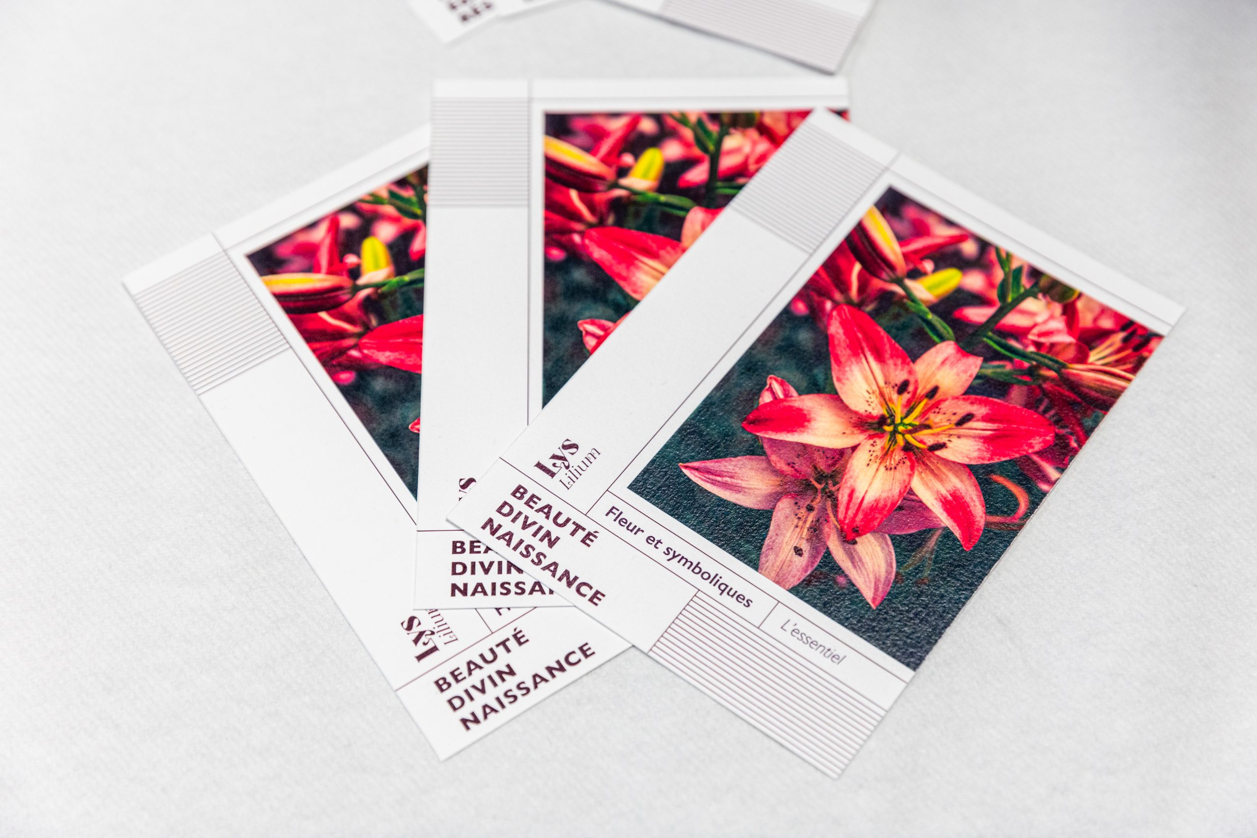
Phytographie is a project designed to highlight the various symbolic meanings of plants. Indeed, with the multitude of existing plants, it’s sometimes easy to get confused about their uses, or to fall into cliché. Through a collection of books, Phytographie groups and classifies natural elements both alphabetically and by symbolism, to enable designers to understand and use the semiotics of plants in their creations.
Art direction
Phytographie’s visual identity is an homage to nature, using a sober, elegant typography whose ligatures and curves are reminiscent of nature.
The information is structured in a grid, reminding us that despite the randomness of nature, it is built on a strong structure. With a color scheme far removed from the usual shades of green, purple underlines the mystery of nature, both in its symbolism and in its history.
Disciplines
Visual Identity – Branding – Typography – Edition – Web Design
End-of-study project // 2023
